
It’s been over 10 years since the release of the first model of the iPhone. Back then, most people had primitive mobile devices, limited mostly to making calls and receiving brief text messages.
Anything close to decent was considered a pleasant user experience when it came to mobile. Nobody was concerned about the status quo, because nobody was using unstable mobile devices on a daily basis to browse through sites, make purchases, etc. (at least, not yet)
Over the years, however, a powerful shift has moved users’ primary point of entry from desktop machines with fast, reliable network connections to relatively underpowered mobile devices with connections that are often slow or flaky. Unfortunately, Google reports state 53% of users abandon sites that take longer than 3 seconds to load; the average load time takes up to 19 seconds on a 3G connection and 14 seconds on a 4G connection.
Now you might ask yourself: right, but how does that happen? Why does the page load take 19 seconds? I wrote some CSS, it is responsive, it should work!
Here’s the problem: the UI looks like it works, but it doesn’t work in the real world. If you think about your mobile users, a good amount of them are still using median devices — the ones they receive for free with a new mobile plan, with just 1GB of RAM. They are a little (or even a lot) better than years ago, but still slow and suffering from poor connectivity.
There’s clearly a significant gap between today’s consumer expectations, the capabilities of their devices, and the mobile behavior of most sites. The patterns we have developed for building feature-rich web apps are just not sufficient for a mobile device user anymore. In order to create the best experience, the PRPL pattern can be key to improved mobile website development and user experience.
PWAs To The Rescue
When trying to ensure that a web app is suitable for a mobile device, most organizations develop responsive apps. It could appear as a great solution to our previously mentioned problem: the pages automatically respond to the screen size, UX stays consistent across all platforms, and we only have one code base for both mobile and desktop platforms. Unfortunately, this solution comes with some limitations. Responsive Web Design has clear network dependency; as soon as the connection is lost, your page is gone. If your connection is slow, you will automatically see layout and UI glitches.
Responsive Web Design is a fast and simple solution — it doesn’t solve all problems, but it does solve some of them, and quickly. It works best, however, when it naturally moves on to Progressive Web App. While PWAs are quite new and emerging, this architecture allows your app to inherit all main behaviors of RWD such as push notifications or GPS awareness, but also offers some advanced features. Not only is the app visible immediately after entering the page, but it also works better on a slow internet connection. What’s more, thanks to clever caching methods, your content can be visible and flawless even if you are not connected to the internet.
One of the ways to achieve that improved behavior lays in a pattern for structuring and serving Progressive Web Apps with emphasis on the performance of app delivery and launch.
It’s known as the PRPL pattern:
- push
- render
- pre-cache
- lazy-load
It is not a specific technology or tools, but more of a mindset and a long-term plan for improving the performance of mobile web. The specific implementation of each of the steps is out of the scope of this article, but feel free to do additional research for more information.
Page Loading Process
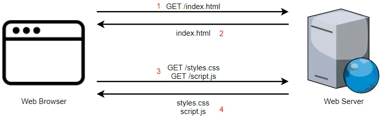
What does it take to load a page, from the moment you first open that page to the moment it’s fully loaded and you can interact with it? When you try to open a site on a mobile device, an initial request is sent to a remote server somewhere far away. After some time, the server brings the response, usually in the form of an HTML document. After that, your browser runs through the HTML file to check what other resources are needed; for each additional resource, your browser needs to make a separate call to the server in order to get that resource. You’ve probably noticed: that’s a lot of calls. How do we optimize that performance?
Push Critical Resources
Not every file in your application has the same level of importance. Browsers know this, and using their own heuristic they are able to decide which files they should be fetching first. It’s useful to also tell the browser which files are more important to us. There are multiple ways of preloading critical resources faster. Some of them include rel=”preload” and rel=”prefetch”, however you may also want to explore webpack options.It may be useful to keep in mind that prefetch is better for getting ready the resources needed for different navigation routes. In general, both of these methods allow you to mask the initial latency by preparing the resources that are important but usually take some time to load. This way your browser reads through HTML and instantly warms up the connection with the source, so by the time the browser got to the last line of the HTML file, the resource is ready to be rendered.
Render An Initial Route As Soon As Possible
Providing basic user experience as soon as possible is critical when it comes to convincing users that the site they entered is worth staying on. How does it feel when you open a site that starts loading, and the only thing you see for the next 15 seconds is a blank screen? I always ask myself: is it loading? Is my connection not working? Maybe it’s my phone that is not working? Downloading and processing external stylesheets is probably blocking the content from being rendered until the whole process has finished. That creates an opportunity for improvement.
There are some parts of an application that can be pushed earlier to provide some basic user experience and assure the user of the loading progress. One method is to extract styles responsible for minimum initial rendering and inlining them in the HTML document. You can either implement that solution yourself or use already existing packages such as critical package. This way the browser would be able to render the styles right away. Another approach to improve first paint is to server-side render the initial HTML of your page. This displays content immediately to the user while scripts are still being fetched, parsed, and executed. However, this can increase the payload of the HTML file significantly, which can harm the time it takes for your application to become interactive and thereby respond to user input. There is no single correct solution to reduce the initial load of your application, and you should only consider inlining styles and server-side rendering if the benefits outweigh the tradeoffs for your application.
Pre-Cache Remaining Routes
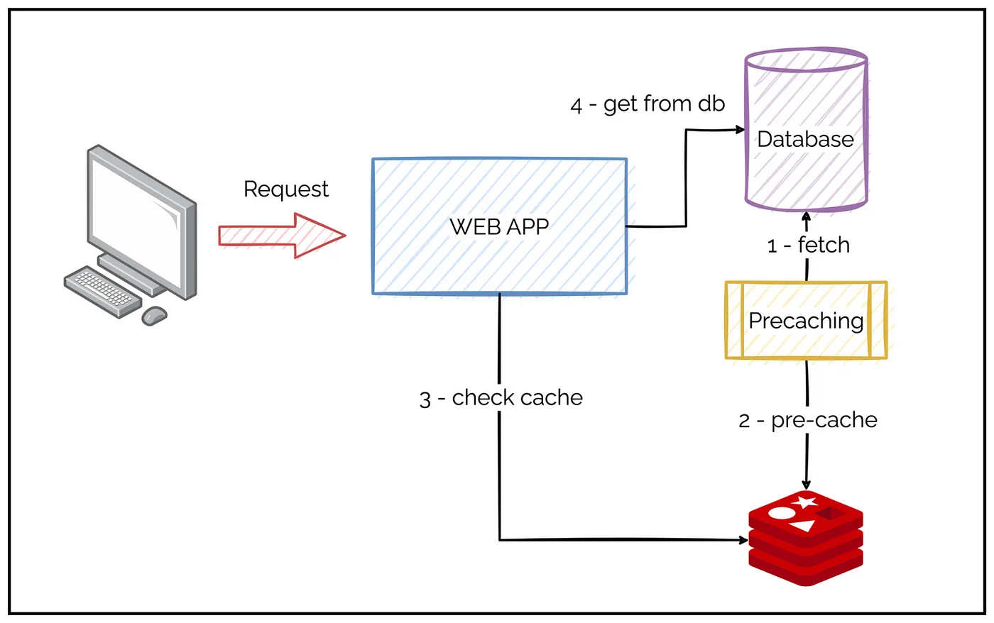
As you probably already noticed, minimizing server-side trips can be crucial in the process of shortening page load time. Here’s where the service worker really shines. Using a service worker cache allows you to store the resources that make up the shell. On repeat visits, your browser can fetch assets directly from the cache rather than the server. This way your user will not only be able to use your application offline, but also enjoy a much faster page load. You can either create the service worker file and write the logic yourself, or use libraries such as Workbox that can make this process easier.
Lazy-Load
We’ve arrived at the moment when all of our assets are finally delivered by the server at the speed of light, but the initial paint is still slow; what’s taking so long? Almost always the most expensive asset happens to be a JavaScript bundle. From the moment it gets loaded to the moment the UI gets fully interactive, your browser goes through a few phases: it has to download the files, parse through them, compile, and finally execute. In simple terms, after your browser’s received all the resources, it now has to compute what all the files combined together look like, and how they work together. The bigger the bundle you ship, the longer it will take for the browser to parse through it and put it together.
What does it really mean for the user? Shipping a large bundle of JavaScript can significantly delay how your user will be able to interact with UI components. That means your user will be tapping on the UI without anything meaningful happening. The previously mentioned phases don’t take a lot of time on a desktop machine, but on a median mobile device, it can take forever. So how do we manage to quickly load the rest of the code necessary for the application to run? Should we just load the entire code all at once?
Instead of providing users with all of the code that makes up the entire application as soon as they land on a site you could split the code based on used routes, otherwise known as code splitting. The idea behind it is to give the user small chunks of the code that takes the currently used route. As the user navigates through the site, the browser makes additional requests for more of the fragments of code that haven’t been cached yet, and creates required views, known as lazy loading. This is another feature that you could implement yourself, but it may be worth it to use existing packages and plugins instead, such as an aggressive splitting webpack plugin.
Closing Thoughts
Nowadays, through improvements in Internet browsers, the expectations toward mobile websites are set very high. The purpose of the first websites over 20 years ago was simply to share information; these days the Internet provides everything from grocery shopping, maps, real estate, social networks, chatting, tickets… everything. If you are hoping for maximum engagement from your customers, improving their mobile experience by delivering content fast and reliably may be the way to go.