Various forms like sign-ups, logins, or checkout pages are seen everywhere in applications and websites, but what attracts a user to fill one out? What exactly makes one click the sign-up or call-to-action button on the page? Forms exist to be filled out, but there are a surprising number of forms which — through poor design, excessive fields, or other factors — push users to abandon them, unfilled. Make your forms simple and easy to navigate, and watch the data come flowing in.
Here are a few best practices when putting together your own forms to keep engagement high:
1. Ask For Less Information (and have an easy login!)
If you have a page with a sign-up flow for a new mobile app, what do you want to know from your user? It depends on what the product is and why you need the information from them. As an example: a date or friend matching platform would want your age, gender, and zip code on one screen. The next page could be preferences about the person you are hoping to match with. All of this information is necessary for the app’s purpose, but connecting to Facebook or Google has also made it much easier to skip certain steps in this process, allowing for less info needing to be manually filled out.
The following demonstration shows just how easy it is for the user to access all of the fields needed — i.e. name, picture, friends — from the Facebook API instead of filling out the same information manually.

2. Single-Column Ease vs. Multi-Column Stress
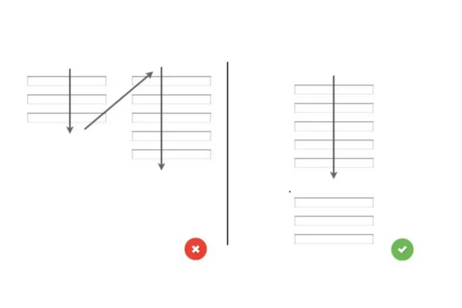
When you’re making a form, make sure it’s displayed in a single-column instead of a multi-column. This design element will make it easier for users to scan through and complete instead of trying to tab through different fields and with the potential of resulting frustration.
The following demonstration illustrates, the relative ease for a user to scan through one column, answering questions in a linear format instead of doing a Z-pattern back and forth.

3. Automate, Automate, Automate
One of the best form practices for improving design is automation. Automation makes it easier for the user to go through fields, without worrying about switching from lower and upper cases. The only fields that should not be capitalized are emails and passwords, since those cause delivery issues.
4. Progress Tracker
A user who is filling out a form — unless it’s a simple sign-up — wants to know how long the process will take them, and maybe even if it should be filled out now or saved for later. For mobile and desktop alike, a progress tracker should be included, like the examples shown below.
![]()
If the user is on a certain step it’s important to note that as well, all within an easily understood display of what they’ve already completed.
5. Testing (even when you don’t want to)
This is the step that many don’t even think of taking, since the design could be flawed and more time could be wasted in redesigning. The form you just created should be tested on a few different devices (at the very least on mobile and desktop) to see if it actually works and makes sense. What’s the point of developing a product that doesn’t work for the user?
The ultimate goal is getting the user to click on the “continue” or “submit” buttons in the end. By following these best practices, you can remove common roadblocks in form submissions and make the experience better for your users.